In today’s world, the world of Big Data, Data Visualization with its different tools and techniques is becoming more and more important by the day. This is for facilitating the communication of the information of the tremendous amounts of daily-produced data in order to make data-driven decisions.
Data Visualization is the translation of information into visuals, to make the data easier for the human brain to understand and comprehend, and extract insights from them.
This indicates that Data Visualization is the usage of different visual techniques in order to communicate data, which makes the turning of data into insights easier for your readers.
Data Visualization provide a quick, an effective, and a universal manner to communicate data and insights by means of a number of visual techniques.
What is the Importance of Data Visualization?
It's hard to think of any industry or company who doesn’t need to visualize the data they have.
We need to visualize data because it gives us a summary of information and which consequently makes the recognition of patterns and trends much easier than just looking at rows of data on spreadsheets.
Why do we use Data Visualization?
With the mere looking and data sets, it’s just about impossible to extract information or draw any conclusions. This is why data visualization is always needed whether it's basic a visualization or an interactive dashboard.
Using data visualization and data visualization tools makes data become readable and more understandable for decision-making.
What makes Data Visualization Good?
When visualizing data, you have to put in mind that there should always be a balance between the form and the function; a plain graph could fail to grab the reader’s attention towards the information that it wants to communicate. And even the most splendid visual could fail to communicate its key findings.
This is why it’s of the utmost importance that one should understand the significance of having both data and visuals working side by side towards the goal of delivering insights to readers.
There're 3 elements that are always included in a good data visualization:
- Analysis
- Storytelling
- Design
Think of them as a process; start with the analysis of your data, then you have to think about creating a story that links all your key findings together, and after that you start creating the design or how you’re going to represent your key findings together.
-
Data Analysis:
“Without Big Data Analytics, companies are blind and deaf, wandering out onto the web like a deer on a freeway.” – Geoffery Moore
Data is not just numbers, because with the analysis data becomes a huge place where one can discover and study for the sake of getting insights.
Data Visualization depends on data analysis in providing two things:
- Patterns
- Relationships
-
Patterns:
Important for predictions.
Exploring the data in a way to find noteworthy patterns can tell you how the world is working and as well as how it is changing.
-
Relationships
In data analysis, relationships are usually correlation.
Correlations are important since it shows how data affect each other.
-
Storytelling with Data:
“Numbers have an important story to tell. They rely on you to give them a clear convincing voice.” – Stephen Few
Since the main idea behind data visualization is the communication of insights to your audience, you have to take the point of view of your audience into consideration. This means that an effective data visualization has to tell a story to the audience with the usage of the language and the ideas that are easy for the audiences to understand.
The importance of storytelling is generated from the fact that it explains what is going on with the data sets, through providing context and meaning.
-
Good Data Visualization Design:
A good and a potent data visualization design makes sure that all those seeing it thoroughly understand what it says and represents.
Here are the 5 categories that include the different types of data visualization:
- Hierarchical
- Geospatial/Spatial
- Multidimensional
- Temporal
- Network
-
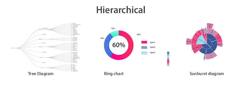
Hierarchical:
These are the visualizations that order groups of data within larger groups.
They're most suitable to be used in case of wanting to lay out information clusters especially when they have the same point of origin.
It includes:
- Tree Diagrams
- Ring Charts
- Sunburst Diagrams
-
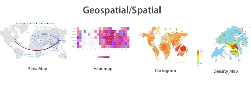
Geospatial/Spatial:
This is related to the real-life physical locations; it overlays on maps.
It includes:
- Flow Map
- Heat Map
- Cartogram
- Density Map
-
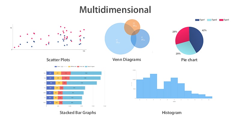
Multidimensional:
Just like the name is suggesting, multidimensional data visualization always have more than one variable that are mixed together for the sake of creating a 3D data visualization.
It includes:
- Scatter Plots
- Venn Diagrams
- Stacked Bar Graphs
- Pie Charts
- Histograms
-
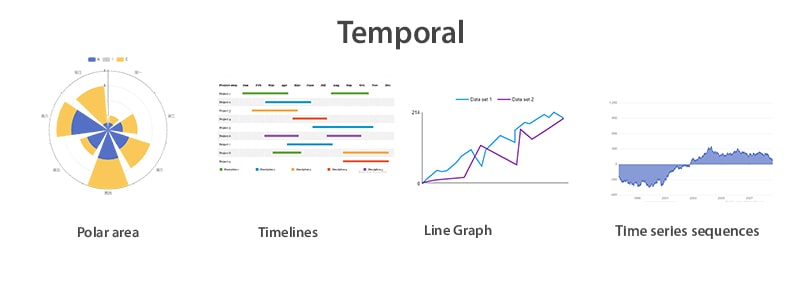
Temporal:
Temporal data visualization often features lines that stand alone.
It includes:
- Scatter Plots
- Polar Area Diagrams
- Timelines
- Line Graphs
- Time Series Sequences
-
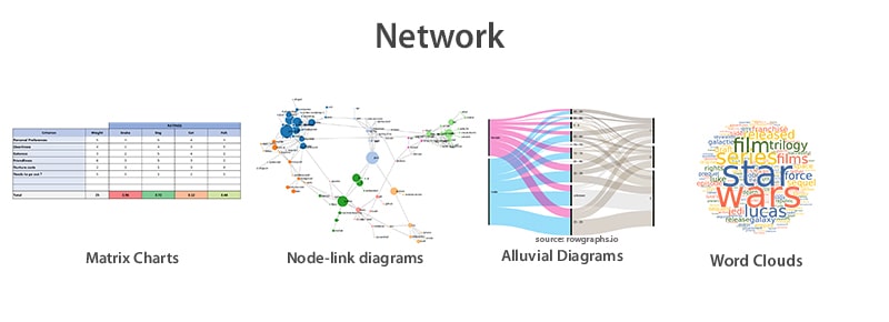
Network:
Network Data Visualization shows the relationships between datasets and how they connect with one another.
It includes:
- Matrix Charts
- Node-link diagrams
- Alluvial Diagrams
- Word Clouds
Here is a list of the top 10 most used graphs and charts:
- Bar Chart
- Line Chart
- Scatterplot
- Pie Chart
- Heat Map
- Area Chart
- Column Chart
- Bubble Chart
- Funnel Chart
- Tree Map
You may also check: Data Visualization: A List of the 10 Most Used Graphs
How to choose the type that fits your needs?
In order to be able to pick up the most suitable type that fits your intended data visualization, you have to be able to identify:
- The kind of relationship that you’re trying to understand between the data sets you have.
- If you’re looking for distribution of data or just looking at the outliers.
- The values you’re comparing. Are you comparing various values? Or are you analyzing one single value over a certain period of time?
- Your interest in trends. Are you interested in analyzing trends included in your data sets?
Data visualization is neither an easy nor is it a straightforward kind of a process. This is why data visualization tools come in handy.
Data Visualization Tools:
Data Visualization tools are software that work on taking data from specific sources and turn it into visuals (graphs, charts…)
They provide designers with an easier way to create visual representations of large data sets. When dealing with large data sets, the automation of the visuals creating process makes a designer’s job much easier.
