What is Data Visualization?
Data Visualization is the representation of data and information using different types of charts and graphs. This is done with the intention of communicating insights in the most readable and understandable manners.
Read More – Your Complete Guide to Data Visualization
When it comes to visualizing your data, there’re numerous types of graphs and charts that you can use in order to make the most out of the data you have.
Here is a list of the most common used graphs and charts:
- Bar Chart
- Line Chart
- Scatterplot
- Pie Chart
- Heat Map
- Area Chart
- Column Chart
- Bubble Chart
- Funnel Chart
- Tree Map
-
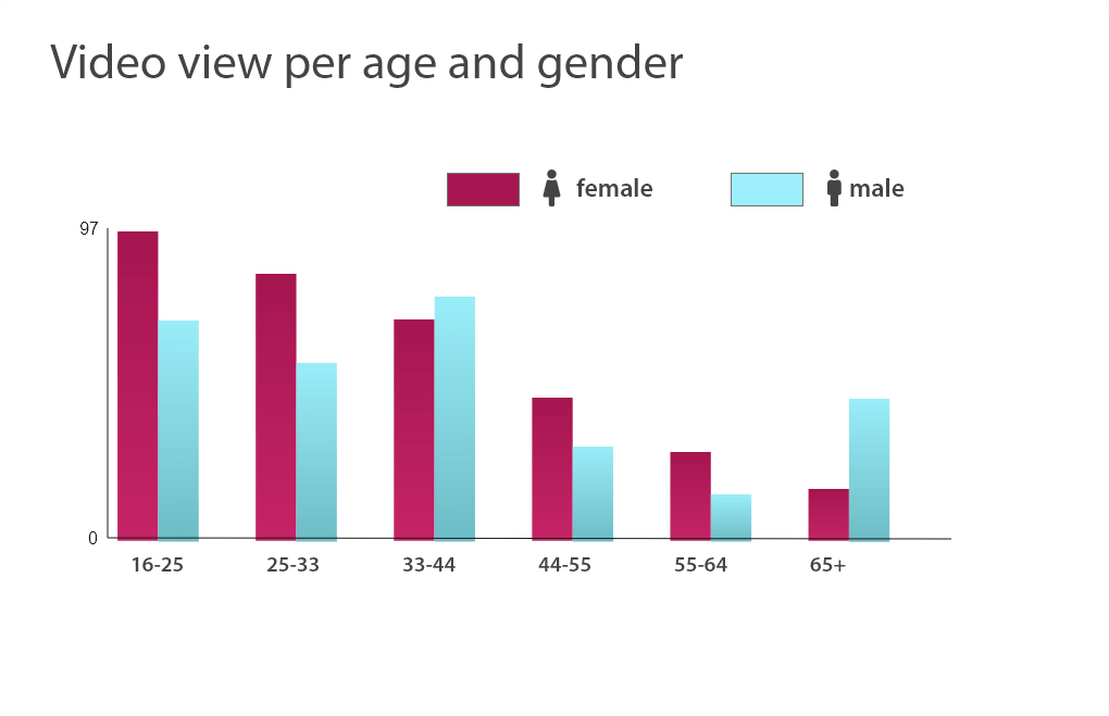
Bar Chart:
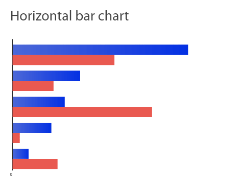
Bar Chart is a data visualization that represent the data in vertical or horizontal bars.
When it comes to summarizing a set of categorical data, bar charts are really helpful.
Bar Charts has two axes; one is for the numerical values and the other is for the description of the categories being compared.
When do I use Bar Chart for my Data Visualization?
Use Bar Charts for the following reasons:
- When comparing different categories of data.
- When showing how multiple data sets relate to one another.
Bar Chart isn’t your best choice in case:
- You’re visualizing continuous data.
- You’re visualizing a category that only has one value associated to it.
Best Practices when you’re using Bar Charts in your visualizations:
- Start your Y-axis at 0, so that you’re able to keep your data in order.
- Use consistent colors throughout your graph so that it’s easy for your readers to identify relations.
-
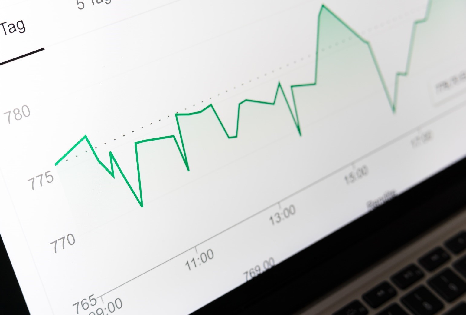
Line Chart:
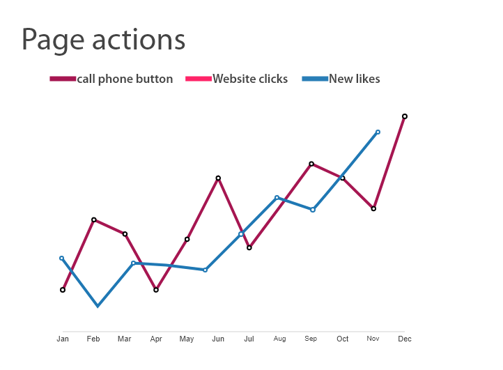
Line Chart is the data visualization chart type that uses lines in order to show patterns in data and how two data sets change in relation to one another.
Just like bar charts, line charts are used to help visualizing data in a compact and a precise manner. It’s used to reveal trends or progress over time.
When do I use Line Chart for my Data Visualization?
Use Line Charts for the following reasons:
- When charting a continuous data set.
- When wanting to show patterns and trends in data.
- When comparing different but relevant data sets.
Line Chart isn’t your best choice in case:
- You’re viewing an in-depth analysis of the data.
Best Practices when you’re using Line Charts in your visualizations:
- Don’t compare more than four categories in the same line chart.
- Use one color only for each line; but make sure to change colors for different categories in order to avoid confusion
-
Scatter Plot:
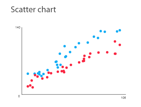
Scatter plot data visualization is also known as Scattergram.
It’s the diagram that pairs numerical data with having a variable on each of the x-axis and the y-axis, in order to look for a relationship between them.
It’s usually used when having different data points and one wants to highlight similarities between the data sets.
When do I use Scatter Plot for my Data Visualization?
Use Scatter Plot for the following reasons:
- Showing a relationship between two variables.
Scatter Plot isn’t your best choice in case:
- You want a clear and a precise data points.
- You want to rapidly scan the data and the information.
Best Practices when you’re using Scatter Plot in your visualizations:
- In order to avoid confusion, make sure you start the Y-axis at 0.
- In case you decide to use trend lines, it isn’t advisable to use more than two lines in the same chart in order to make your chart readable and understandable.
-
Pie Chart:
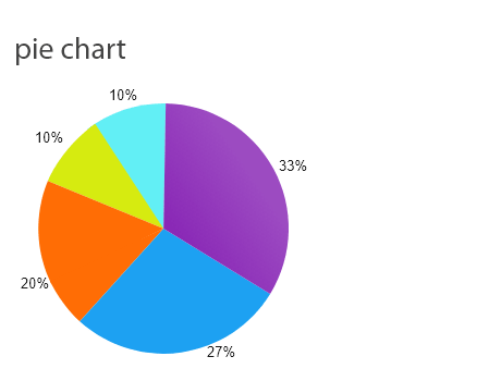
Pie Chart is the type of data visualization chart that is used to display data in a circular graph.
Pie chart gives you a quick look into how different categories are broken into smaller pieces.
It’s used to represent a number of percentages where the sum of all sections MUST add up to 100%.
When do I use Pie Chart for my Data Visualization?
Use Pie Chart for the following reasons:
- When comparing relative values.
- When comparing parts-of-a-whole.
- When in need of quick scanning of metrics.
Pie Chart isn’t your best choice in case:
- You need to precisely compare data.
Best Practices when you’re using Pie Chart in your visualizations:
- The sum of all the slices should add up to 100%
- Order the pieces according to their sizes.
- Don’t visualize too many categories in the same chart.
-
Heat Map:
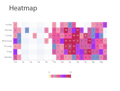
Heat map data visualization works on the showing of the relationships between two measures.
It also provides rating information; the rating information is displayed using different colors or different saturations of the same color.
When do I use Heat Map for my Data Visualization?
Use Heat Map for the following reasons:
- When showing a relationship between two measures.
- When illustrating an important detail.
Heat Map isn’t your best choice in case:
- Visualizing individual, unconnected metrics.
Best Practices when you’re using Map Chart in your visualizations:
- Design a simple outline for your map in order to avoid any kind of distractions away from your data.
- Use different shades or saturations of the same color in order to make the changes in data clearer to the eye.
- Avoid the use of multiple patterns.
-
Area Chart:
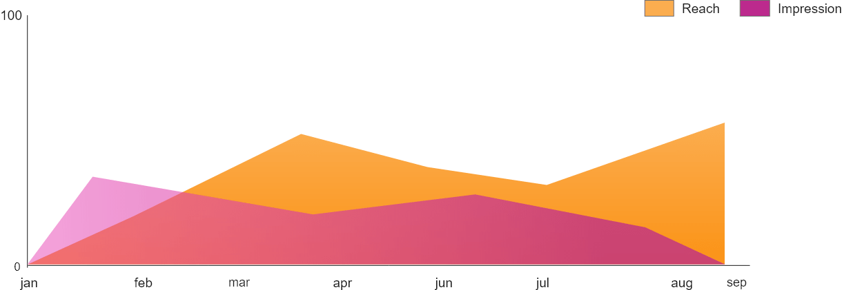
Basically, an area chart data visualization is the same as the line chart with the difference that the area between the x-axis and the line is filled with either a color or a pattern.
When it comes to highlighting differences between items, area charts do better job than line charts.
When do I use Area Chart for my Data Visualization?
Use Area Chart for the following reasons:
- When communicating part-to-whole relationship.
- When comparing overall trends opposed to individual values.
Area Chart isn’t your best choice in the case of:
- Comparing a large number of categories.
- Needing the exact values and not just a comparison between trends.
Best Practices when you’re using Area Chart in your visualizations:
- Display no more than four categories.
- To make your chart easier to read, organize high variable data at the top of your chart.
- Use transparent colors so that information and data don’t get lost in the background.
-
Column Chart:
Column chart is also known as Vertical Bar Charts.
It is the data visualization where the data of each category is represented by a rectangle; the top of the rectangle is proportional to the values each of them has.
When do I use Column Chart for my Data Visualization?
Use Column Chart for the following reasons:
- When comparing the values of each category.
- The data you’re visualizing has a small number of discrete categories with a single value for each category.
Column Chart isn’t your best choice in the case of:
- The comparison of large number of categories.
- The represented values are rates.
Best Practices when you’re designing column Chart in your visualizations:
- Use consistent colors throughout the chart.
- Write horizontal labels to make the chart more understandable.
- Start your y-axis at 0.
- Organize your categories where the highest category is placed on the left.
-
Bubble Chart:
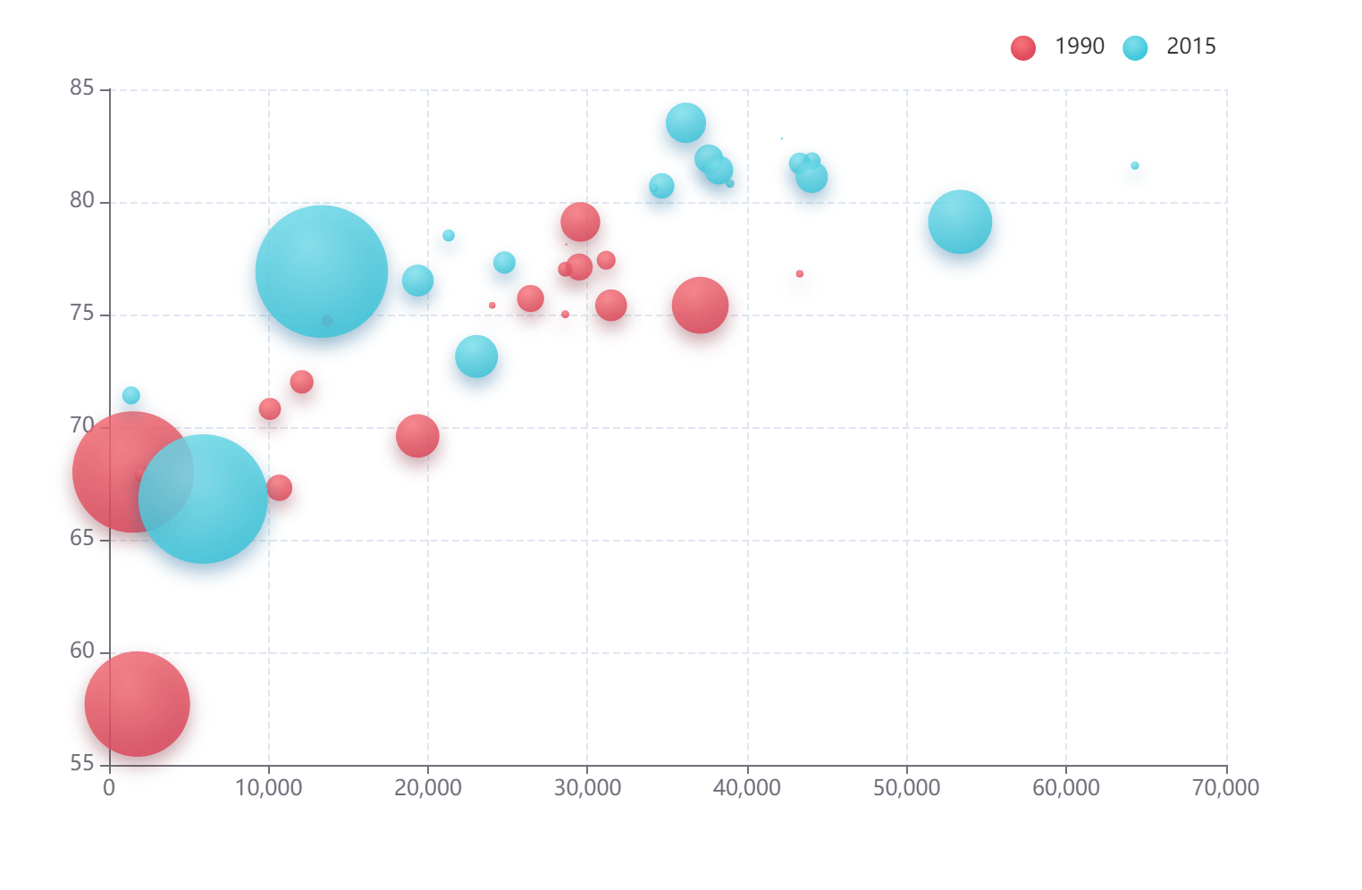
Bubble chart could be considered as a generalization of Scatter Plot. It shows multiple circles (bubbles) in a two-dimensional plot.
A Bubble Chart is usually used when in the need of displaying three numeric values.
Each of the bubbles on the chart corresponds to a single data point; the values of the three variables are indicated by: a) the horizontal position, b) The vertical position, and c) the size of the bubble itself.
When do I use Bubble Chart for my Data Visualization?
Use Bubble Chart for the following reasons:
- Allowing readers to process a large amount of numerical values.
- Displaying a relation between three variables.
Best Practices when you’re designing Bubble Chart in your visualizations:
- Scale the used bubbles according to their areas not their diameters.
- Use circular shapes only.
- Make sure labels are clear and visible.
-
Funnel Chart:
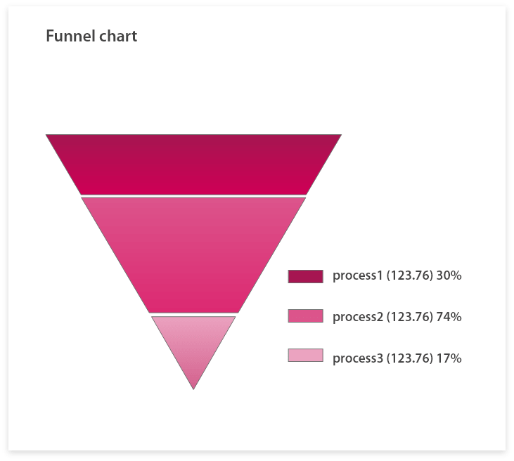
Funnel chart is the data visualization that represents the moving of something throughout different stages in a process.
Funnel Charts should be your data visualization of choice when you want to track a sales process or a marketing funnel.
When do I use Funnel Chart for my Data Visualization?
Use Funnel Chart for the following reasons:
- Displaying a series of steps with each step’s completion rate.
Funnel Chart isn’t your best choice in the case of:
- The visualization of individual and unconnected metrics.
Best Practices when you’re designing Funnel Chart in your visualizations:
- As the size of the funnel decreases, use contrasting colors or one color with different saturations.
- Include at least three stages in your funnel chart or use a part-to-whole representation like Pie Chart or single stacked bar.
-
Tree Map:
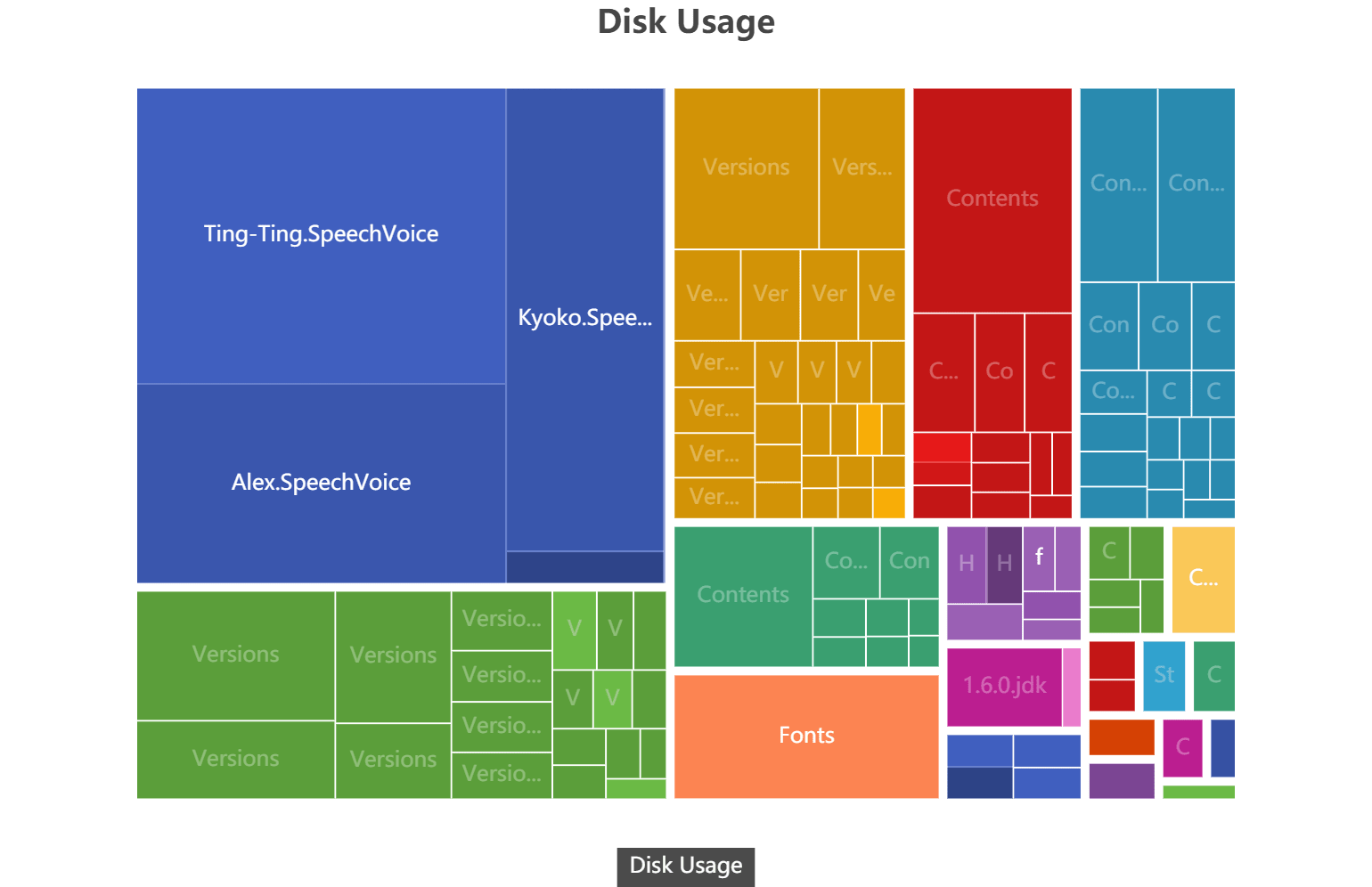
Tree map is data visualization that is used in the case of wanting to display hierarchical data.
When do I use Tree Map for my Data Visualization?
Use Tree Map for the following reasons:
- When displaying a-part-to-whole relationship between data.
- When delivering a quick data analysis.
- When data in only in a hierarchical order.
Tree Map isn’t your best choice in the case of:
- Needing precise comparisons between categories is important.
- Having flat, non-hierarchical data.